Microsite hub for live dataviz pieces and dashboards.
An interactive look at how America’s wealth has grown — and who has been left out. With Rick Newman.
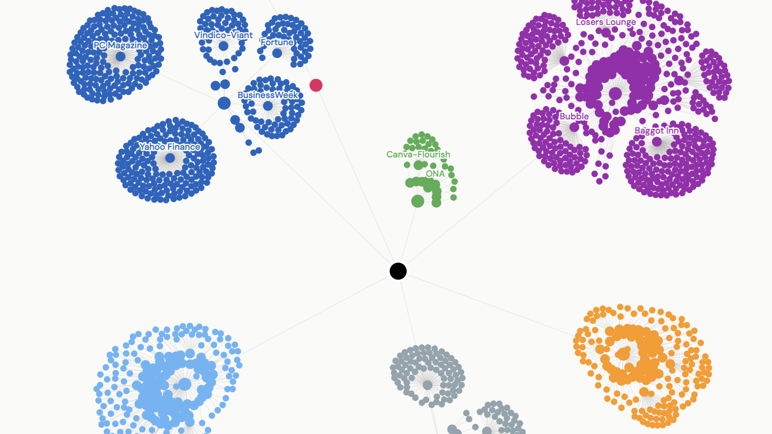
An animated D3 network tracing three decades of journalism, data visualization, and a parallel life in music — one connection at a time.
An interactive map exploring NYC pizza ratings by neighborhood—because the data never lies.
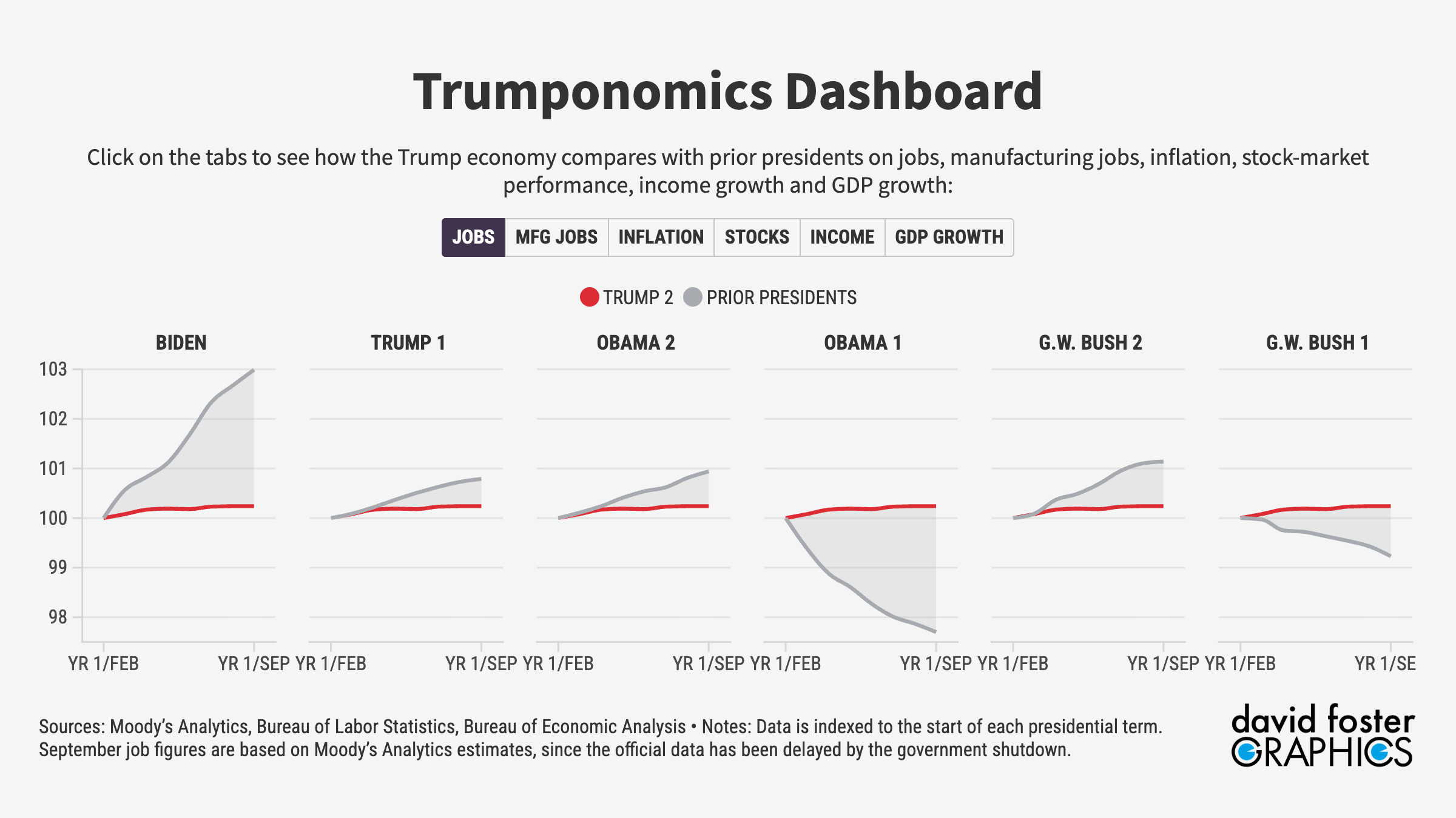
Interactive dashboard comparing jobs, inflation, stocks, income, and GDP growth with prior presidencies.
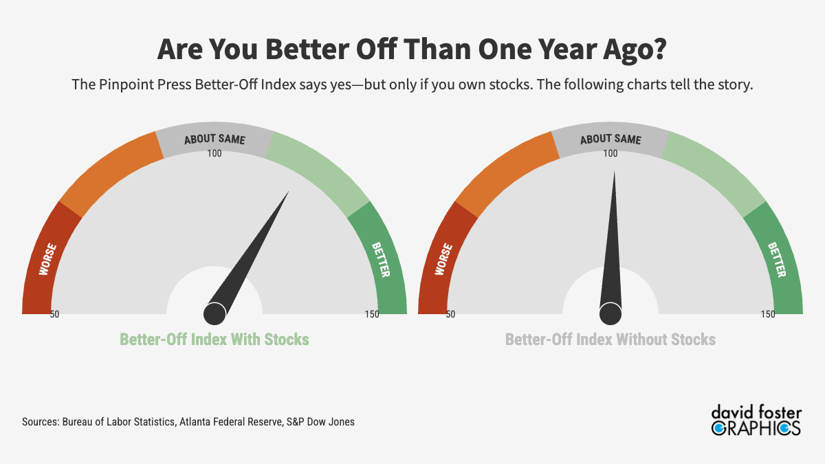
Headline gauge, historical index (with & without stocks), and the four metrics behind it.
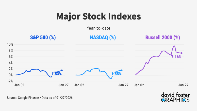
Live charts tracking major market and macroeconomic signals in one place.
How every S&P 500 sector has performed year-to-date in 2026, from energy's surge to health care's slump.